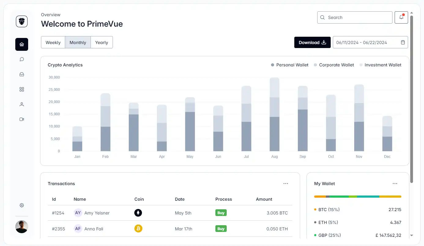
How to Override CSS Styles in PrimeVue: Advanced Techniques for Component Custom
PrimeVue is an exceptional Vue UI component library designed for Vue 3, offering 90+ out-of-the-box components and flexible customization capabilities that have made it a favorite among developers. However, real-world projects often demand tailored component styling solutions. This article reveals advanced techniques for overriding PrimeVue component styles, covering scenarios from quick adjustments to deep customization. Special attention is given to integrating PrimeVue with Tailwind CSS, changing component sizes, and addressing common challenges like CSS overrides and prop modifications.

Inline Styles: Rapid Adjustment Tool
Use Case: One-off tweaks, prototype validation
<Button :style="{ padding: compactMode ? '8px' : '12px' }" />
Override styles directly via inline style attributes, but be mindful of CSS specificity. Ideal for temporary debugging, though long-term use may cause code bloat.
Advantages:
- Component-level scoping
- Instant visual feedback
Limitations:
- Global CSS may override styles
Pro Tips:
- Use
!importantsparingly for forced overrides - Leverage Vue 3’s
v-bindfor dynamic style values
<InputText :style="{ width: isMobile ? '100%' : '300px' }" />
Theme Customization: Systematic Styling Solution
Modify Sass variables for cohesive design changes:
// _variables.scss
$primary-color: #3B82F6;
$button-padding: 0.875rem 1.5rem;
Works with PrimeVue’s built-in theme system, supporting:
- Preset theme switching (Material, Bootstrap, etc.)
- Custom theme generators
- Dynamic theme toggling
Global CSS: Batch Style Override Strategy
Create global CSS files to override component classes, perfect for modifying PrimeVue’s foundational styles.
Best Practices:
- Create
prime-overrides.css
.p-button {
  transition: all 0.3s cubic-bezier(0.4, 0, 0.2, 1) !important;
}

.p-datatable .p-datatable-tbody > tr {
  height: 60px;
}
- Use deep selectors to penetrate scoping
:deep(.p-button-label) {
  font-weight: 600;
}
Key Notes:
- Use Chrome DevTools to identify exact class names
- Avoid excessive !important usage
- Pair with PostCSS for scoping control
StyleClass Property: Targeted Component Part Styling
PrimeVue’s component part API solves precise requirements like changing the size of PrimeVue components.
Example:
<Dropdown
  styleClass="custom-select"
  :pt="{
    root: { class: 'w-[300px]' },
    trigger: { class: 'bg-red-100' }
  }"
/>
.custom-select .p-dropdown-label {
  font-size: 14px;
}
Benefits:
- Zero global style pollution
- Supports responsive state classes (e.g.,
p-disabled)
Pass Through API: Atomic-Level Style Control
Available in PrimeVue 3.4+, this low-level API enables granular styling:
const pt = {
  root: { style: 'border-width: 2px' },
  input: { class: 'bg-gray-100' }
  }

<InputText :pt="pt" />
Advantages:
- Per-component-layer control
- Perfect integration with PrimeVue Tailwind workflows
- Compatible with CSS-in-JS solutions
PrimeVue + Tailwind CSS Integration
While PrimeVue delivers rich UI components and Tailwind CSS offers utility-first styling, their combination unlocks unparalleled flexibility. Discover two integration modes for PrimeVue Tailwind override:
Simple Mode:
Use Tailwind for layout management while retaining PrimeVue’s default styles.
Advanced Mode (Unstyled):
Fully customize components using Tailwind CSS in PrimeVue’s Unstyled Mode.
Implementation
1. Installation:
npm install @primeuix/tailwindcss-primeui
2. Configuration:
- Tailwind v4: Import the plugin in your CSS file:
@import "tailwindcss";
@import "tailwindcss-primeui";
- Tailwind v3: Add the plugin to
tailwind.config.js:
plugins: [require('tailwindcss-primeui')]
Overriding Component Styles
Tailwind utility classes may fail to override default styles due to CSS specificity.
Solutions:
1. !important prefix (not recommended, for emergencies):
<InputText class="!p-8" />  <!-- Tailwind v3 -->
<InputText class="p-8!" />  <!-- Tailwind v4 -->
2. CSS Layers (recommended):
// PrimeVue configuration
cssLayer: { name: 'primevue', order: 'theme, base, primevue' }
Hybrid Strategies: Enterprise Styling Solutions
Combine multiple methods for complex scenarios requiring changes to PrimeVue component props and styling:
- Use Pass Through API for structural overrides
- Apply global CSS for brand consistency
- Utilize Tailwind for responsive layouts
- Implement theme variables for dynamic theming
Common Questions
1. Is PrimeVue a wrapper?
No—it’s a native Vue 3 component library with dedicated element structures.
2. How to change props in PrimeVue?
Use component props directly or leverage the pt API for CSS/attribute modifications.
3. How to change CSS of PrimeVue?
Choose from inline styles, global overrides, theme variables, or the Pass Through API.
Conclusion: PrimeVue Style Customization Quadrants
| Scenario | Recommended Method | Maintenance Cost | Key Technique |
|---|---|---|---|
| Rapid prototyping | Inline styles | High | Leverage component properties |
| Branding alignment | Theme customization | Low | Use design tokens |
| Deep customization | Pass Through API | Medium | Master component DOM structure |
| Third-party integrations | StyleClass | High | Scope isolation |
By mastering these techniques—especially the PrimeVue Tailwind override workflow and component size adjustment methods—developers can achieve pixel-perfect implementations while maintaining clean, maintainable codebases.


Comments 0
There are no comments yet.